

Since the beginning of the pandemic, we worked on the development of numerical methods and statistical analysis that could help the understanding and control of the pandemic. Most studies refer to analyses obtained from mobile mobility data, along with mathematical and statistical models. The studies involve a large team and a wide collaboration network (collaborators)
Mobility data
- About georeferenced mobile mobility data (inloco)
- Social Isolation index for thousands of Brazilian cities (March-2020 to March-2021)
- Mobility analyses between Brazilian cities
Scientific Results
- Modeling future spread of infections via mobile geolocation data and population dynamics (Plos-ONE)
- Social distancing and epidemic dynamics (Cell Patterns)
- Evolution and epidemic spread of SARS-CoV-2 in Brazil (Science)
- Super-spreader cities, highways, and intensive care availability (Scientific Reports, Nature Portfolio)
- A mathematical optimization platform for intervention against Covid-19 in a complex network- Robot Dance (Euro J. Comp. Optimiz.)
- Three-quarters attack rate of SARS-CoV-2 in the Brazilian Amazon during a largely unmitigated epidemic (Science e Lancet)
- Genomics and epidemiology of the P.1 SARS-CoV-2 lineage in Manaus, Brazil (Science)
- Higher risk of death from COVID-19 in low-income and non-White populations of São Paulo (BMJ – Global Health)
- Using Seismic Noise Levels to Monitor Social Isolation (Geophys. Res. Lett.)
- Scale-free (fractal) dynamics of Covid-19 (Applied Mathematical Modelling)
Team, partners, collaborators and acknowledgments
Mobility Data
Most of our studies used data from a company called Inloco, which changed its name to Incognia in 2021. The company provides digital intelligence services based on mobile geolocation data. The company has a great concern for data safety and privacy (politica de privacidade) and opened aggregated and anonymous data only for research during the pandemic.
How are data collected?
During 2020, the inloco Software Development Kit – SDK was installed in over 1 fourth of the Brazilian population.
Time and space resolution is very high, but no personal information is tracked.
How are the data processed?
We received the data already anonymized and aggregated to a maximum resolution of hundreds of meters.
")
Social Isolation
Set H3 location of residence based on past positions during the night.
Isolation Index: From those living in a certain H3, what percentage left the cell during the day?
Cities and States are aggregates from H3 level 8.
Mobility
Mobility between places (usually cities) is measured from trip counts from users’ sequences of positions.
We aggregate millions of trips between cities to infer flux between cities.
H3 Grids (https://h3geo.org/) :
- Social Isolation
- Mobility between places
Levels:
- Cities
- Neighborhoods (H3 level 8, ~460 m wide)
- States and larges regions
")
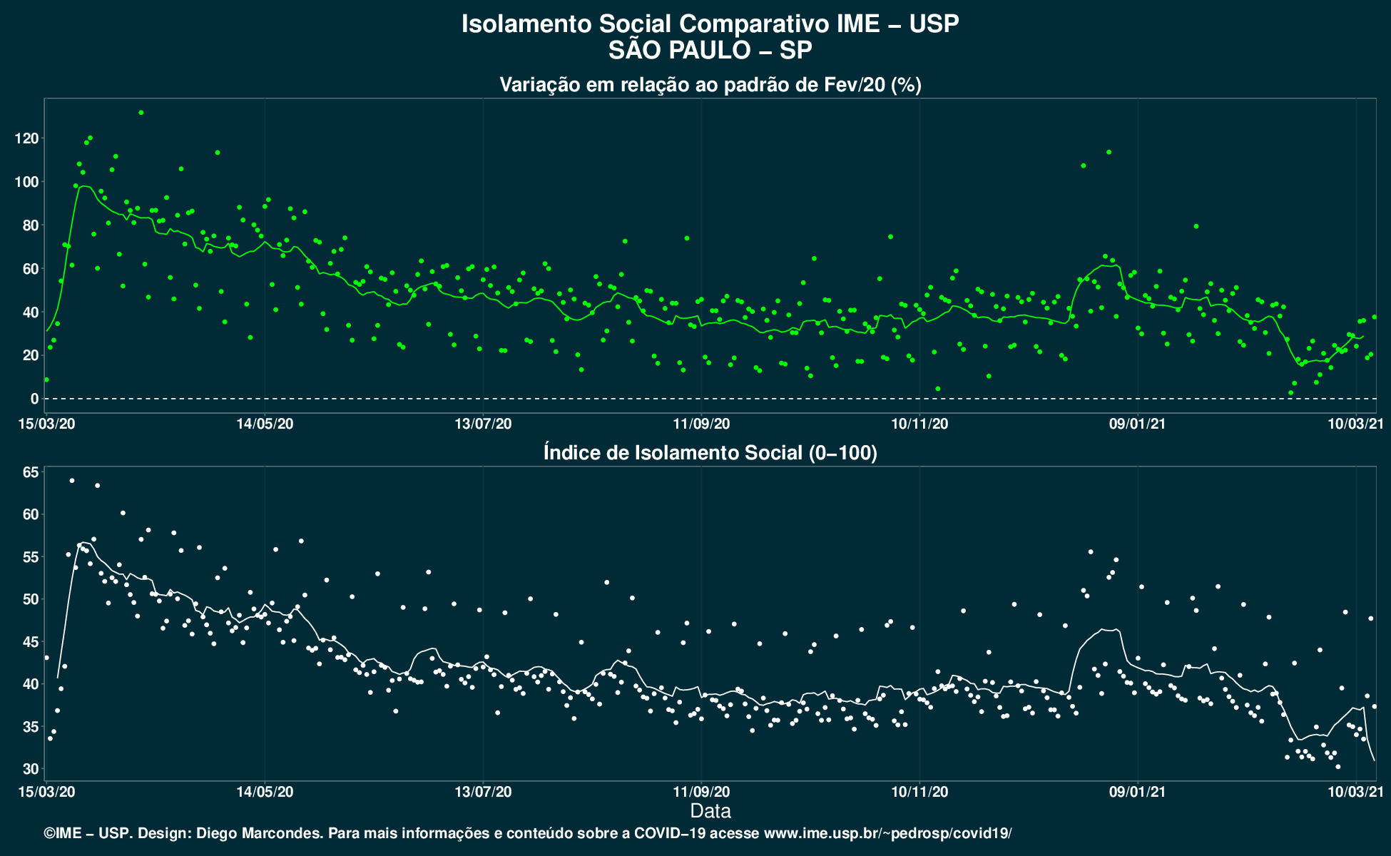
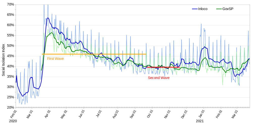
Social Isolation Index
Panel with the index for thousands of Brazilian cities. Click on the map to see data!
The index represents the percentage of people leaving their homes during a given day. We produce 2 graphs:
- Daily isolation IndexIndice and week moving average of index.
- Relative variation of the index from a period prior to pandemic (relative to Feb 2020).
This analysis uses a sample from Inloco company, which does not take into account all the population and may have biases.
(Click on the map to see indexes)
Isolation Index
Mobility Analyses
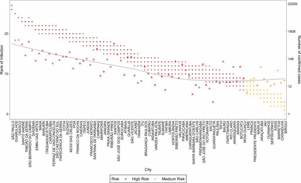
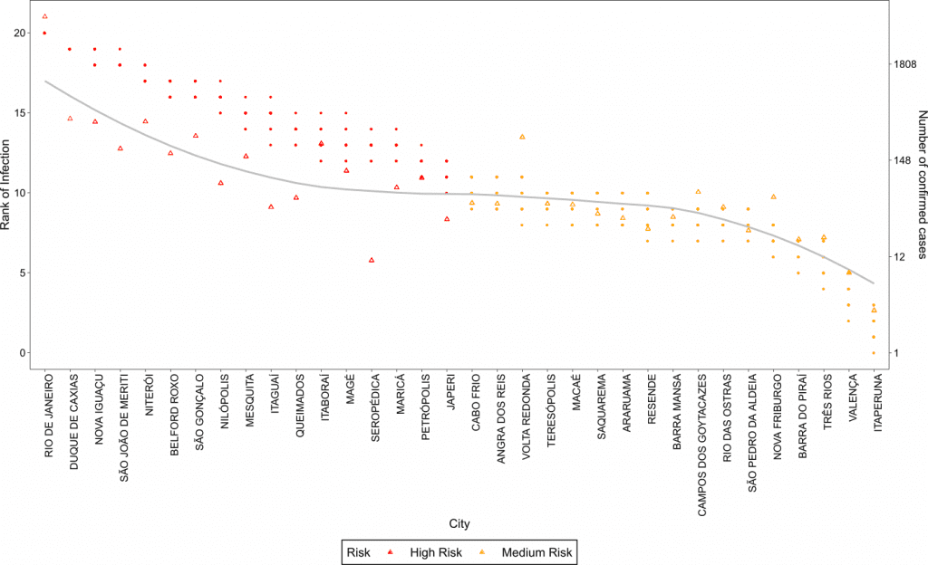
Modeling future spread of infections via mobile geolocation data and population dynamics
Risk analysis for 2 states of Brazil, based on a spreading model using mobile geolocation data. Plos One, (medrxiv)
Warning: This model is not intended to capture the correct amount of infected individuals, but it captures the spreading patterns.
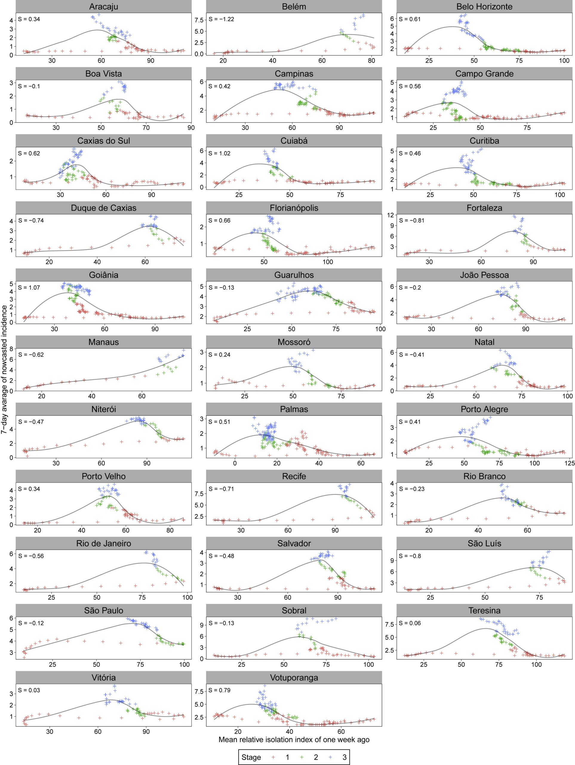
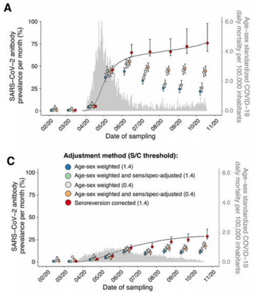
Social Distancing and epidemic dynamics
A snapshot of a pandemic: The interplay between social isolation and COVID-19 dynamics in Brazil. Published in Patterns (Cell Press). (DOI)
During the coronavirus disease 2019 (COVID-19) pandemic, governments used mobility data to assess the effectiveness of social distancing policies, but is it really possible to measure the effectiveness of epidemic control measures using mobility data? In this work, we found that the relationship between mobility data and epidemic metrics is far from being simple in heterogeneous countries such as Brazil, but there are clear relations between them if other factors are taken into account. We have found two regimes under which the outcome of epidemic control measures are related to mobility data, which depend on when social distancing policies were implemented. Early implementation of social restrictions as a preventive measure leads to lower incidence peaks with an overall smaller intensity of the restrictions, while the implementation at later stages, as a remedy for high epidemic metrics, while effective, requires a greater intensity of the restrictions and may bring a greater burden to the health system.
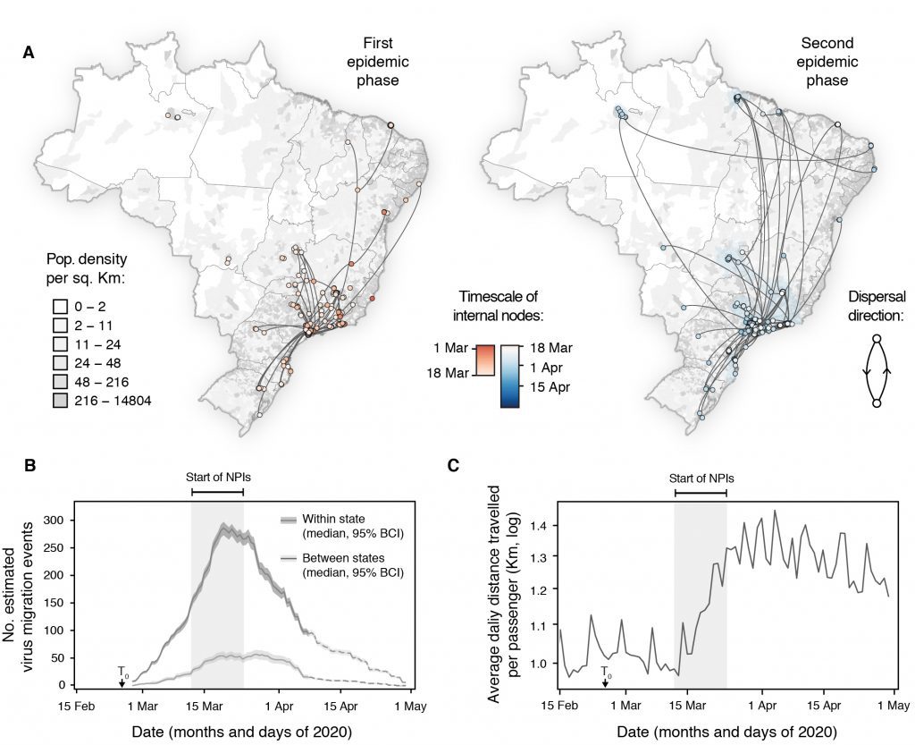
Evolution and epidemic spread of SARS-CoV-2 in Brazil
Effort in collaboration with CADDE and other collaborators (MEDRXIV , DOI), published in Science.
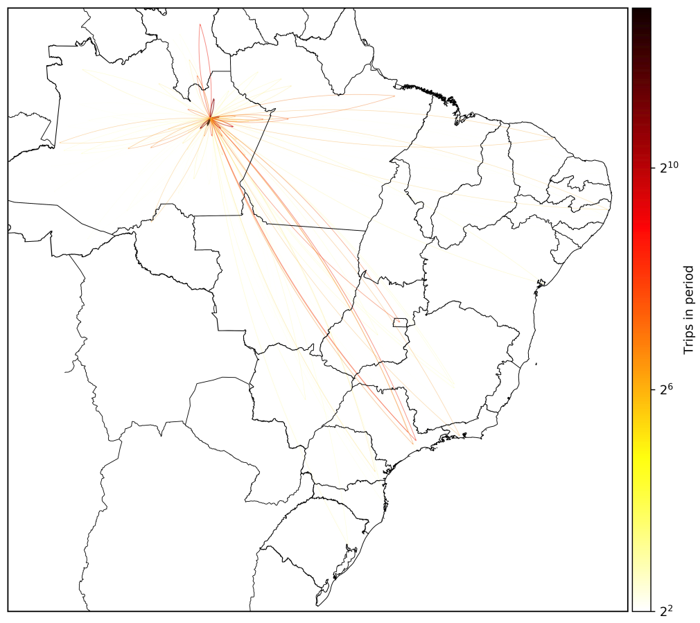
Regional Spreading Factors
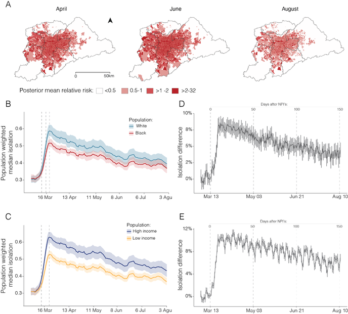
Study of several regional spreading factors. Collaboration with Miguel Nicolelis (Consórsio Nordeste/Duke) and other partners. The preprint was divided into 2 papers, one with the spreading study, published in Nature Scientific Reports, and the other, with Dengue related studies, was strongly modified and is under review in another journal.
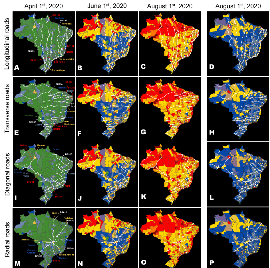
federal highways, as well as the evolution of the geographic distribution of COVID-19 cases on three dates (April 1st, June 1st, and August 1st), and the distribution of COVID-19 deaths on August 1st (last column).
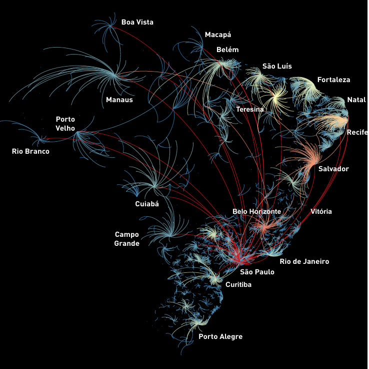
Representation of all “boomerangs” that occurred around major Brazilian state capitals and mid-size cities across the whole country. In this map, arcs represent the flow of people from the interior towards the capital. The arc color code represents the number of interior cities that sent severely ill patients to be admitted in hospitals in a capital or mid-size town; red being the highest number of locations, orange and yellow next, while a smaller number of locations are represented in light blue.
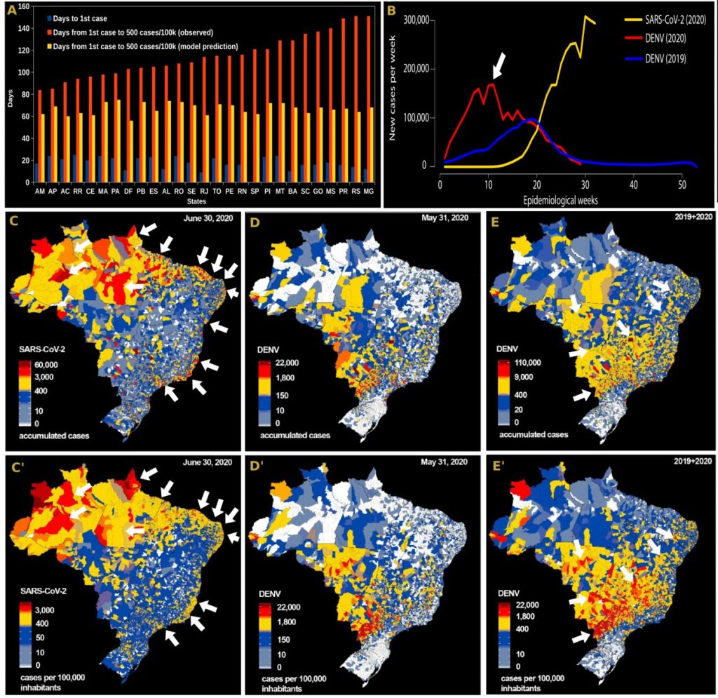
Dengue versus COVID: (A) Bars represent the day the first COVID-19 case (blue bars) was officially reported in each state (using São Paulo’s first case on February 26th , 2020 as the 0 reference), the number of days estimated by a mathematical model for each state to reach 500 cases per 100,000 inhabitants (yellow bars), and the days in which each of Brazilian states actually reach the mark of 500 cases per 100,000 inhabitants (orange bars). Notice how much longer it took for MT, BA, SC, SP, GO, MS, PR, MG to reach the 500/100,000 milestone. (B) Comparison of the evolution of COVID-19 (yellow line), dengue 2019 and dengue 2020 new cases per epidemiological week. (C, D, and E) Comparison between the geographic distribution of COVID-19 cases (C), and incidence (C) until June 30th , 2020, and dengue fever cases and incidence in Brazil (D and D’) until May 31st, 2020, and for dengue cases and incidence (E and E’) summing data from 2019 and until May 31st, 2020.
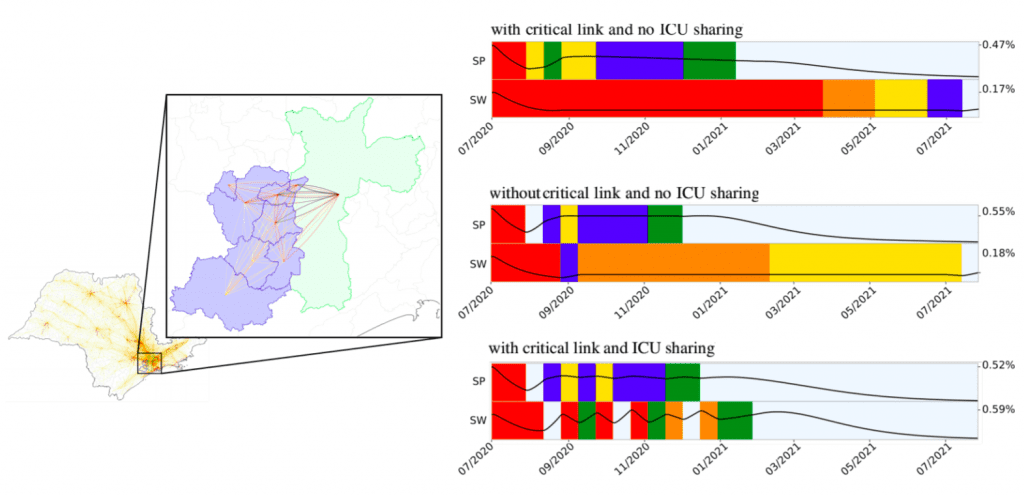
Robot Dance: optimal control of the pandemic
Study of optimal control based on social distancing and hospital bed sharing on a complex network (Euro J. Comp. Optimization). Preprint, DOI
Attack rate in Manaus compared to São Paulo
Paper “Three-quarters attack rate of SARS-CoV-2 in the Brazilian Amazon during a largely unmitigated epidemic”, Science, 2020. See also comment in Lancet, 2021.
Spreading of P1 variant (Manaus)
Genomics and epidemiology of the P.1 SARS-CoV-2 lineage in Manaus, Brazil. Pre-print, Science.
Social and Racial Vulnerabilities in São Paulo
Higher risk of death from COVID-19 in low-income and non-White populations of São Paulo, Brazil. MEDRXIV, BMJ Global Health
Social Isolation and seismic vibrations
Geophys. Res. Lett.: “Using Seismic Noise Levels to Monitor Social Isolation: An Example from Rio de Janeiro, Brazil” (pre-print , published)
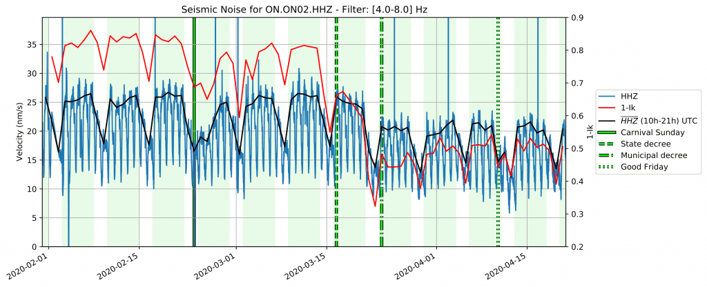
“In Loco” Social Distancing Index (Ik, red line, fraction of the population staying at home).
Scale free (fractal) dynamics of COVID-19
In modeling the spread of diseases, a major question is how to formulate the mechanism of contact between infectious individuals and others in the population. Some of the key issues are: if one person is infected with the disease, how many other people will be at risk? How does the number of contacts differ from person to person? And how does this number change in face of social-distancing measures? In this paper, we describe a model for disease spread in which each infectious individual has a small number of contacts that is independent of the stage of the epidemic and of population size. We find that a”scale-free” or “fractal” model of contagion describes detailed data obtained from a city in Brazil better than traditional models of infectious diseases.
Scale-free dynamics of Covid-19 in a Brazilian city. Applied Mathematical Modelling, 2023, 121, pp.166-184. DOI
Collaborators, partners and acknowledgements – Thanks!
Team, collaborators and partner organizations:
- Colegas e alunos do Departamento de Matemática Aplicada do IME-USP: Sérgio Oliva, Cláudia Peixoto, Renato Vicente, Diego Marcondes (doutorando), Milena Oliveira (mestranda).
- InLoco, em especial o Afonso Delgado. Boa parte das pesquisas realizadas são essencialmente baseadas em dados de mobilidade fornecidos pela empresa, que tem sido uma parceira de primeira desde 2018, em estudos relacionados a dissiminação de dengue no país.
- Governo de Estado de São Paulo, via Patrícia Ellen e assessores (especialmente a Bárbara Régis) e Dimas Covas (diretor do Instituto Butantan), na confiança e parceria dentro do centro de crise do estado.
- Consórcio Nordeste, via Rafael Raimundo (UFPB) e Miguel Nicolelis (Duke).
- Observatório-COVID19-BR , em particular via Renato Coutinho (UFABC), Roberto Kraenkel (IFT-UNESP) e Paulo Prado (USP).
- CADDE, especialmente Ester Sabino (USP), Nuno Faria (Oxford/Imperial), e Rafael Pereira (IPEA), além dos alunos e outros pesquisadores envolvidos.
- COVID-RADAR, em particular o Sami Yamouni (Serasa) e Fabrício Vasselai (Michigan), além de outros pesquisadores envolvidos na iniciativa.
- CEPID-CeMEAI, em particular os pesquisadores Paulo Silva e Silva (UNICAMP), Luis Nonato (ICMC), Claudia Sagastizábal (UNICAMP) e Tiago Pereira (ICMC) na iniciativa RobotDance e outros.
- Itau – Todos pela Saúde, em particular nos projetos de revisão de Mortalidade (Paulo Lotufo – FM-USP) e no projeto de análise de imunidade de rebanho no Amazonas (Ester Sabino IMT-USP e CADDE).
- Diversos professores e pesquisadores da USP, muitos que participaram de discussões iniciais, incluindo o reitor Vahan Agopyan, o pró-reitor Carlos Carlotti e o Diretor do IME, Junior Barrera, por ajudar a estreitar a parceria com o governo do estado.
- Lorena Barberia (USP e Rede Pesquisa Solidária) e colaborades.
- Martin Schreiber (TU Munich) – Long-time collaborator, helped out on the parallelization of geocoding for mobility data, allowing coupled mobility analysis of the whole country.
- Mariana Pereira de Melo (Escola de Engenharia de Lorena – USP) e Cláudia Pio (UNESP)
- Helder Nakaya (FCF-USP)
- Sílvio Ferreira (UFV) e alunos Wesley Cota e Guilherme Costa
- Marcelo Assumpção (IAG-USP) e colegas no divertido cruzamento de isolamento com vibração sísmica.
- Airton Deppman (Física-USP) e colegas da física na análise “fractal” da covid-19.
- Raquel Rolnik (FAU-USP) e colaboradores
- LM|Assessoria Estatística e Laryssa Costa
- Vários outros pesquisadores que temos colaborado nessa empreitada da COVID-19!


Funding:
- FAPESP Jovem Pesquisador 16/18445-7 – e o servidor Ybytu
- CNPq (Bolsa Produtividade)